ATBT 2022Stuttgart, A dedicated exhibition typeface by ATELIER BRÜCKNER
- Typeface
- Variable
- Supported languages
- Latin extended
ATBT (ATELIER BRÜCKNER Typeface) is a versatile variable typeface dedicated for exhibition design.
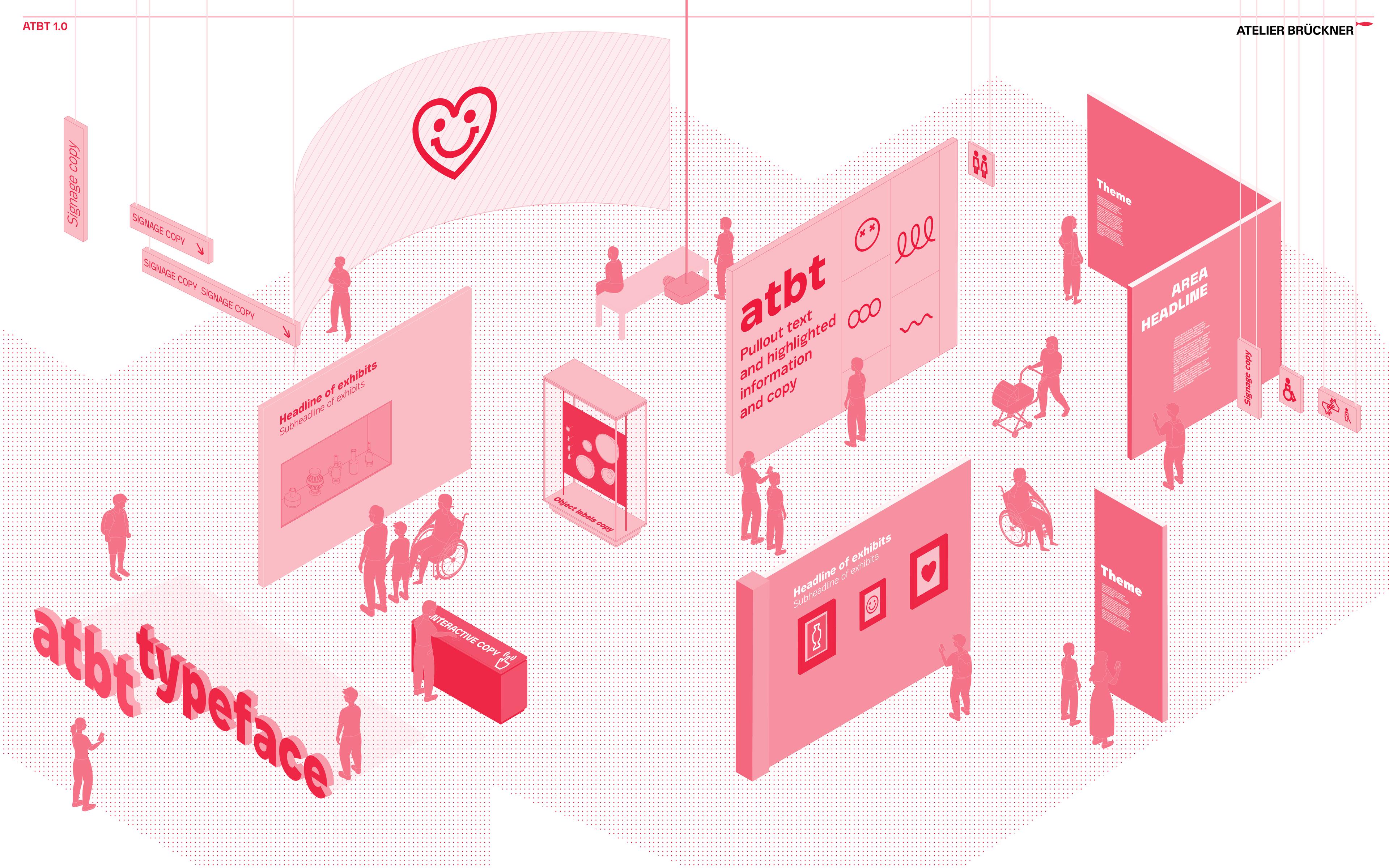
In the field of experiential visual design, be it exhibition graphics and signage or media UI design, we often face the question as to whether a typeface is legible and accessible, whether it offers a wide range of possibilities from display to running, and whether it is appropriate for an exhibition context and the different hierarchies and interactives within it.
Designed in response to these questions, ATBT's wide range of features make it a valuable tool for exhibition and media designers. Its characteristics are intricately crafted and selected to serve its functional purpose, while maintaining an intriguing personality inspired by scenography and the dramaturgical choreography.
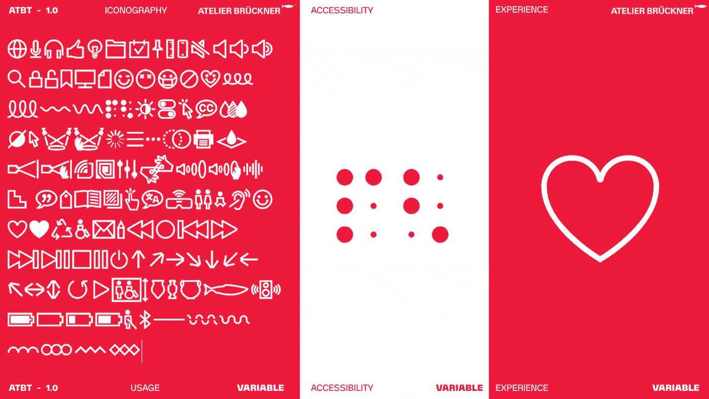
Functionally, it is developed as a variable typeface which covers all the exhibition hierarchies and requirements from displays and titling, to running and interpretive labelling, ranging from thin to heavy, it is easy to find the perfect balance for the spatial and media requirements in an exhibition context. ATBT, especially in its lighter weights, was designed to be accessible, inclusive, and legible. These legible characteristics such as high X-height, big counters, and limited contrast allow it also to work smoothly in different UIs and interpretive print texts. ATBT's iconographic glyphs are also useful resources for those looking for pictorial representations in their design process, as well as in implementation in space such as accessibility icons, signage and way-finding signs, and tech related iconography.
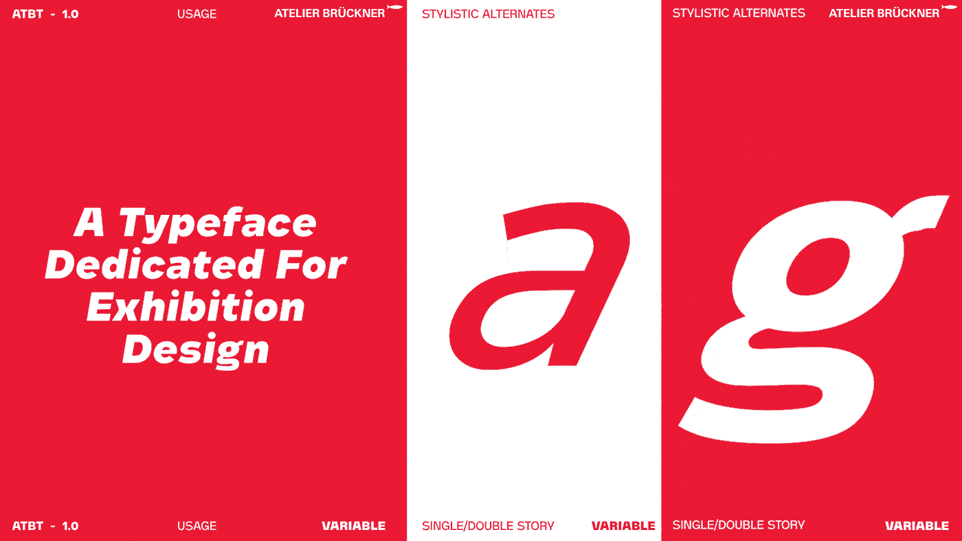
As for its personality, ATBT is a grotesque sans serif typeface with an architectural character that fits well in spatial contexts. While overall, it tries to adhere to effortless neutrality following the base principle that guides ATELIER BRÜCKNER’s work: form follows content, it plays equally with slight manipulations to the anatomy of some letters inspired by the dramaturgical curves in spatial storytelling. Some of these subtle characteristics can be seen in a few ligatures and alternates, in the slightly slanted middle stroke of the “e”, the wide legs of the “M”, the wider range of variable angles of slanting than the standard typefaces, amongst others. As we progress in the weights of each letter, these subtle dramaturgy-inspired shifts get exaggerated even more to produce a more powerful visual punch.
Finally, this typeface is a living one, which is why its upcoming 2.0 release will include more scripts and languages, a larger iconographic set, and additional updates and enhancements.
If you are interested in acquiring this typeface and would like to know more on the terms and prices, please contact us.